
Gear Up Gaming
My Role
Designer & Researcher
Timeline
January - March 2025
Tools Used
Figma, Adobe XD, Procreate, & Adobe Illustrator
Responsibilities
Information Architecture, Wireframing, Prototyping, Research, Testing, & Documentation
Project Overview
About Gear Up Gaming
Gear Up Gaming is an e-commerce platform designed to provide gamers with access to high-quality gaming equipment at more accessible price points. The platform focuses on building a community of budget-conscious players by offering exclusive member benefits, including monthly discount codes delivered via email. By combining curated products with ongoing promotions, Gear Up Gaming aims to make reliable and performance-driven gear more attainable for everyday gamers.
The Problem
Many college-age gamers face financial limitations that make it difficult to invest in high-quality gaming equipment. While they value performance, durability, and overall user experience, their budgets are often prioritized toward essential expenses such as tuition, housing, and food.
As a result, these users are often forced to choose between two unsatisfying options: purchasing low-cost gear that may lack durability and performance, or overspending on premium products that strain their finances. This gap creates frustration and limits their ability to fully enjoy gaming, whether casually or competitively.
The Solution
Gear Up Gaming addresses this challenge by offering a membership-based experience that makes quality gear more affordable. Users can sign up to receive monthly discount codes, giving them access to reduced prices on carefully selected products without compromising on quality.
The platform is designed to be simple and user-friendly, making it easy for users to browse products, understand value, and take advantage of exclusive deals. By lowering the financial barrier to entry, Gear Up Gaming empowers users to invest in dependable equipment while still managing their everyday expenses.
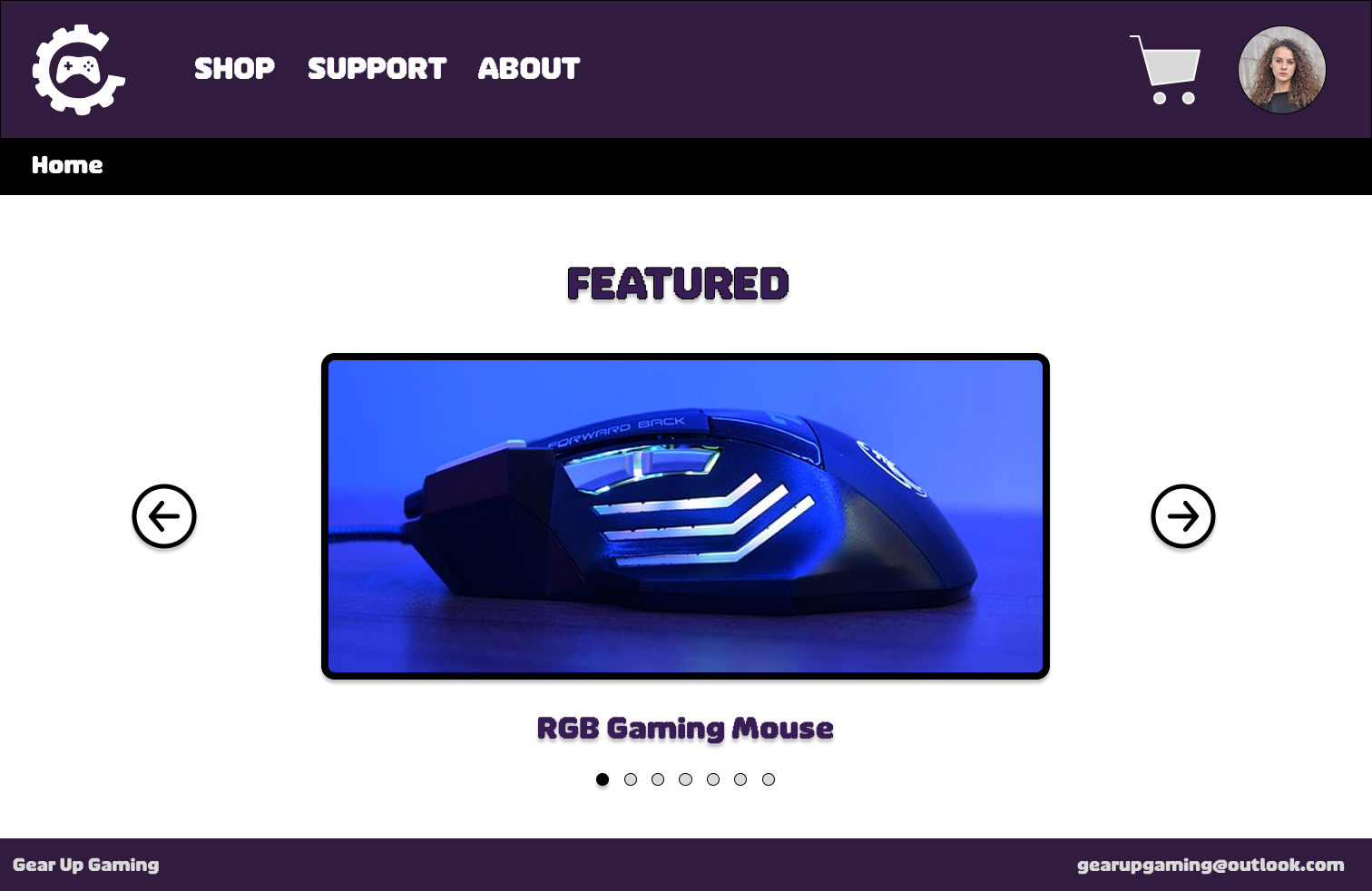
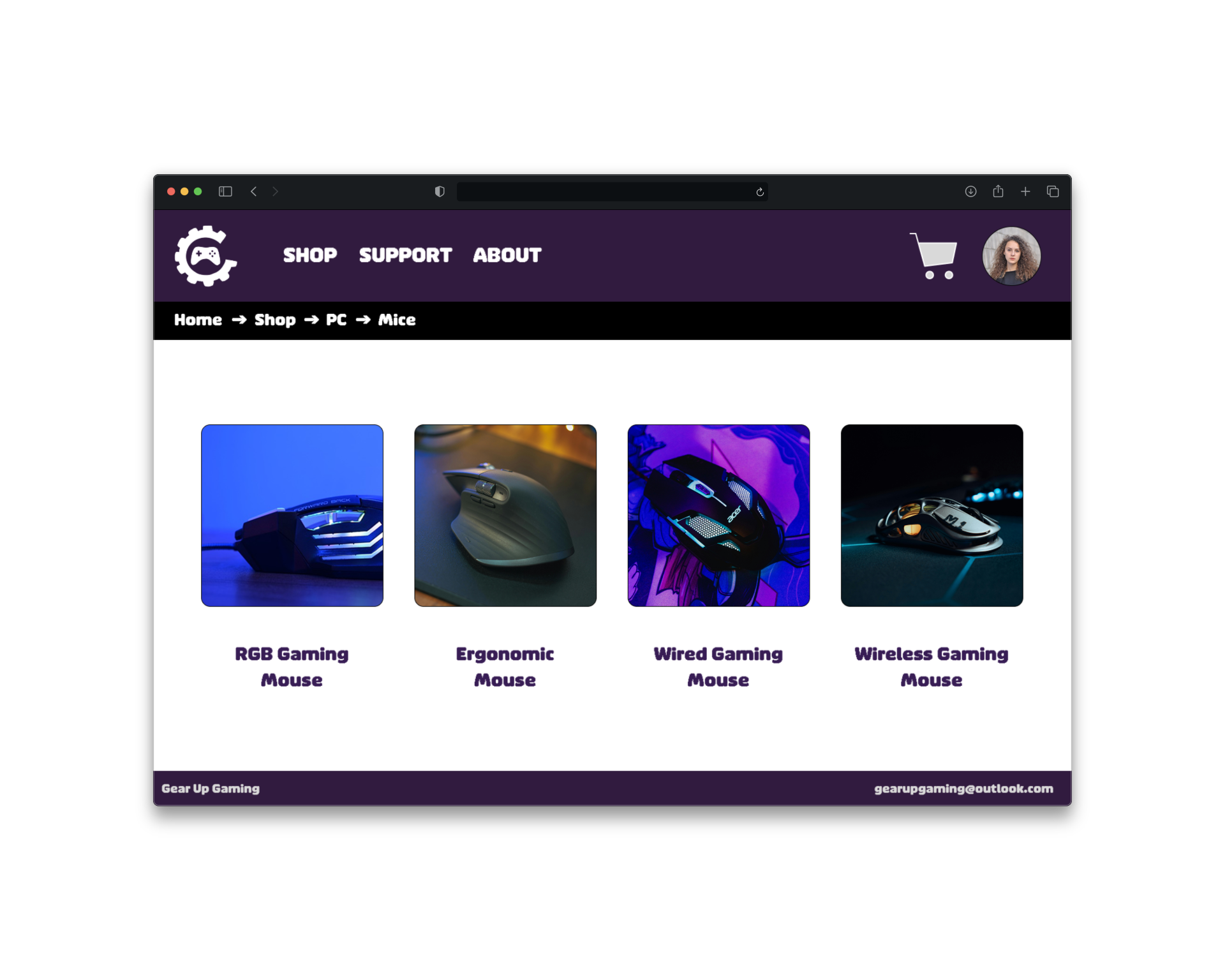
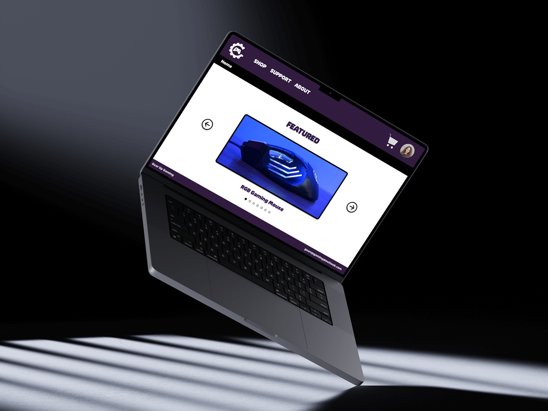
Home Page
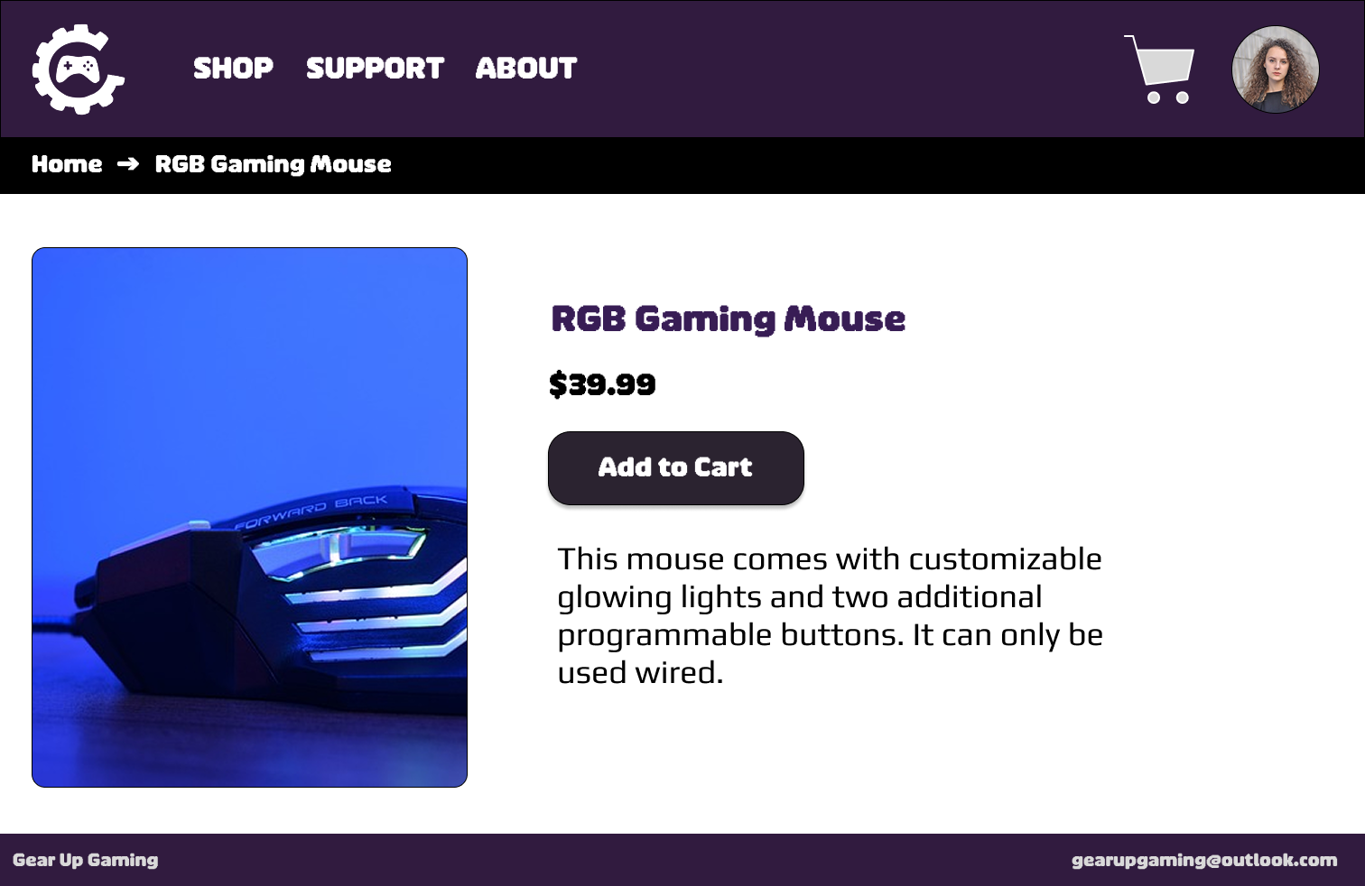
Product Description Page
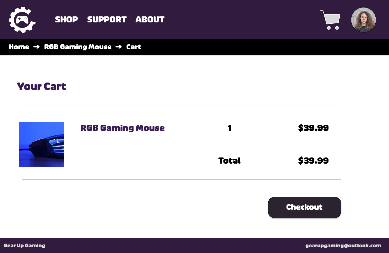
Your Cart Page
Research
Gear Up Gaming is designed for budget-conscious gamers, primarily college students aged 18 to 24, who want affordable but high-quality gaming gear. These users typically have limited disposable income but are comfortable shopping online and researching products digitally. Their main goals are to find trustworthy, reasonably priced products, save time discovering deals, and stay informed about discounts without having to search extensively. However, they often struggle with high prices from reputable brands, an overwhelming number of product options, and a lack of student-focused deals.
User research, including secondary research and competitive analysis, revealed that price is the most important factor, though users are not willing to sacrifice quality. Many prefer waiting for sales, and trust signals like reviews and detailed product descriptions heavily influence their decisions. Communication through email and notifications is effective when it provides clear value. These insights highlighted opportunities to simplify deal discovery, reduce decision fatigue through curated selections, and build trust through more focused recommendations.
To address these needs, the platform includes features such as a member sign-up system with monthly discount codes, curated gaming gear selections, a streamlined checkout process, and email-based engagement that delivers relevant deals and promotions. Together, these features aim to make purchasing more efficient, reduce overwhelm, and improve user trust and retention.
Design Process
I initially began this project in Adobe XD, where I explored early layout concepts and basic user flows. However, as the project evolved, I recognized that Adobe XD did not offer the level of flexibility and advanced features I needed to fully realize my vision. To better support the growing complexity of the design, I made the decision to transition the project into Figma.
Once in Figma, I rebuilt the project from the ground up, using the migration as an opportunity to refine the structure and improve the overall user experience. I started with a core set of 10 foundational frames, which included key screens such as the home page, shop category page, subcategory pages, support page, product detail page, and checkout flow.
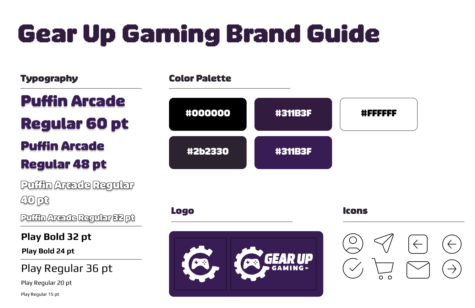
From there, I iteratively expanded the design system by introducing a cohesive typography hierarchy and a consistent color scheme aligned with the brand’s identity. I incorporated imagery and visual elements to enhance usability and engagement, while also ensuring visual consistency across all screens.
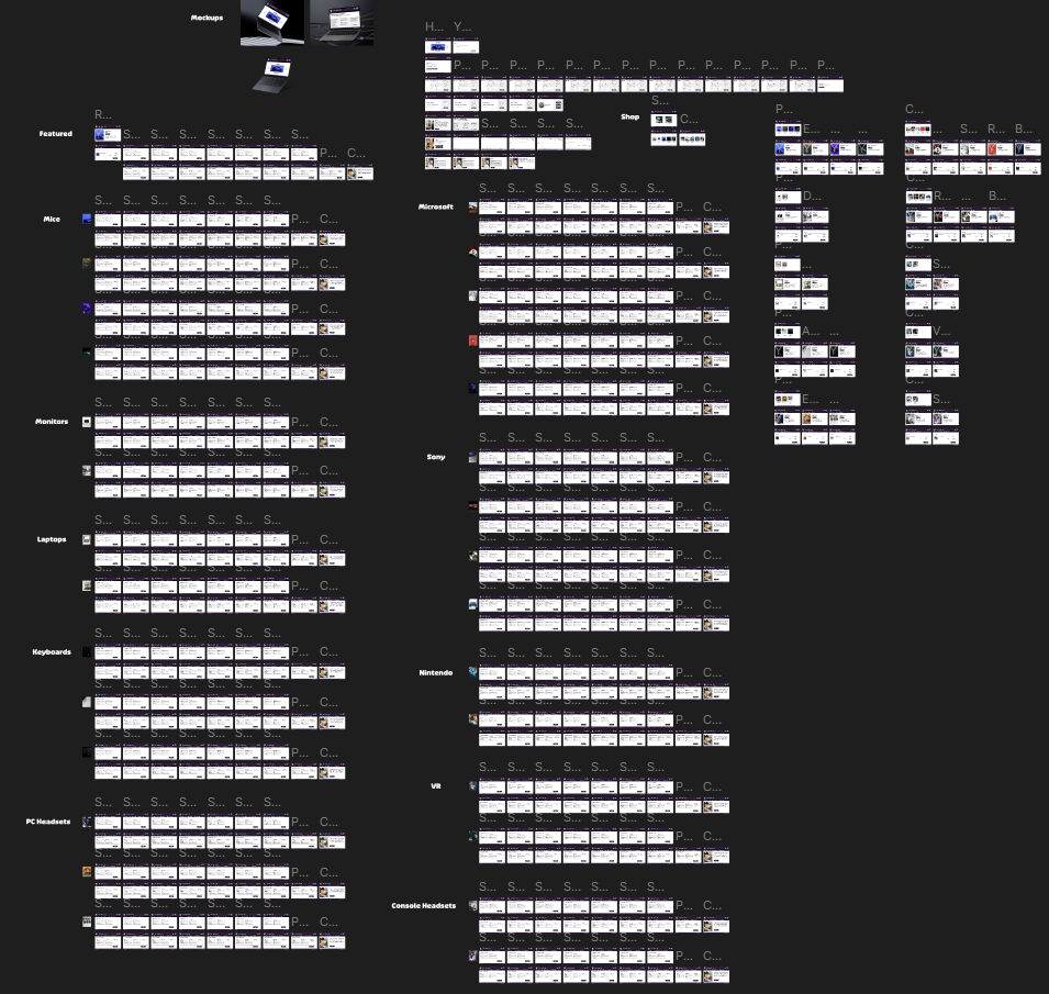
As the project progressed, I focused on connecting each frame through interactive prototyping, creating a seamless and intuitive user journey from browsing to checkout. This process allowed me to think critically about user flow, accessibility, and overall experience, ultimately resulting in a more polished and functional design.
Prototypes
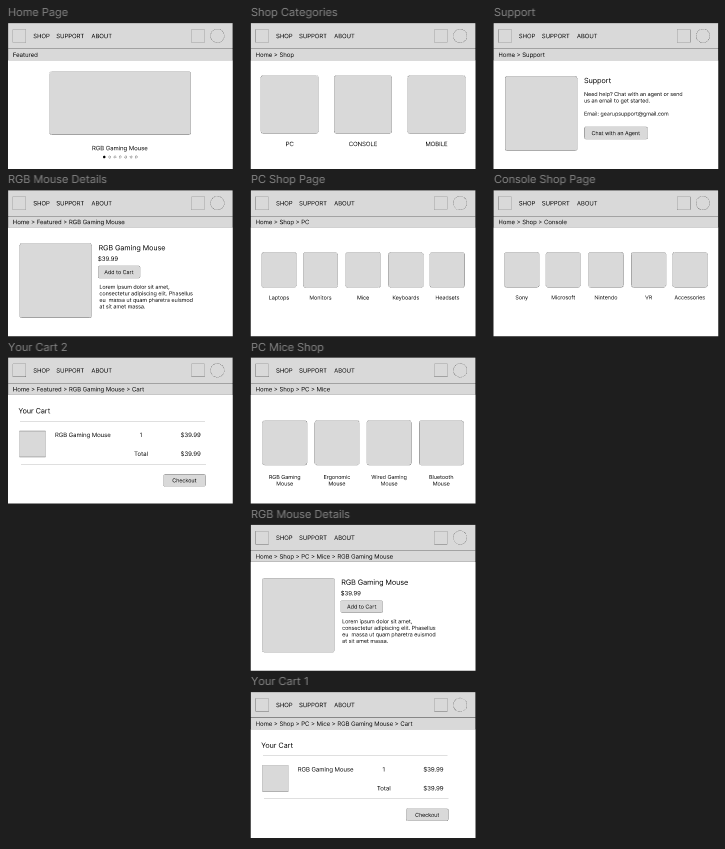
Low-Fidelity Prototype
High-Fidelity Prototype
Testing
To begin testing, I carefully selected participants who matched the target audience by using a short survey. This helped ensure that the feedback collected was relevant and aligned with the intended user group. Once participants were selected, I guided them through the website using a structured test script. This allowed the session to remain focused while still encouraging open and honest feedback.
For this round of testing, users interacted with a low-fidelity prototype and evaluated the overall layout and structure. Participants expressed a need for additional pages, specifically an About page and a Support page, to improve transparency and provide better access to information. Based on this feedback, I incorporated both pages into the high-fidelity prototype to better meet user expectations and improve overall usability.
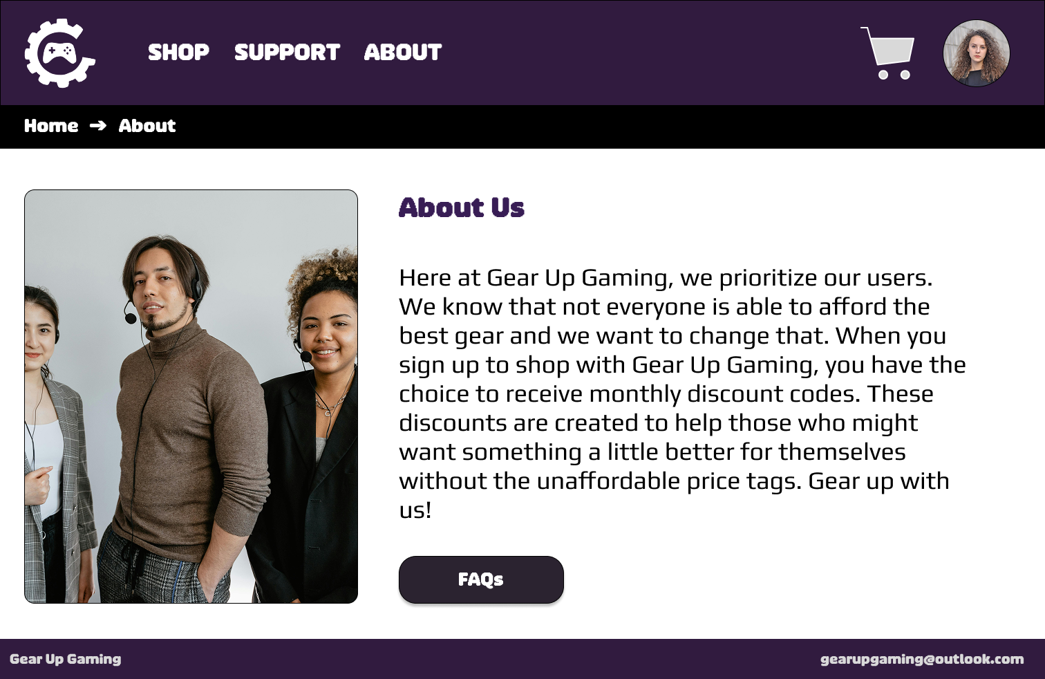
About Page
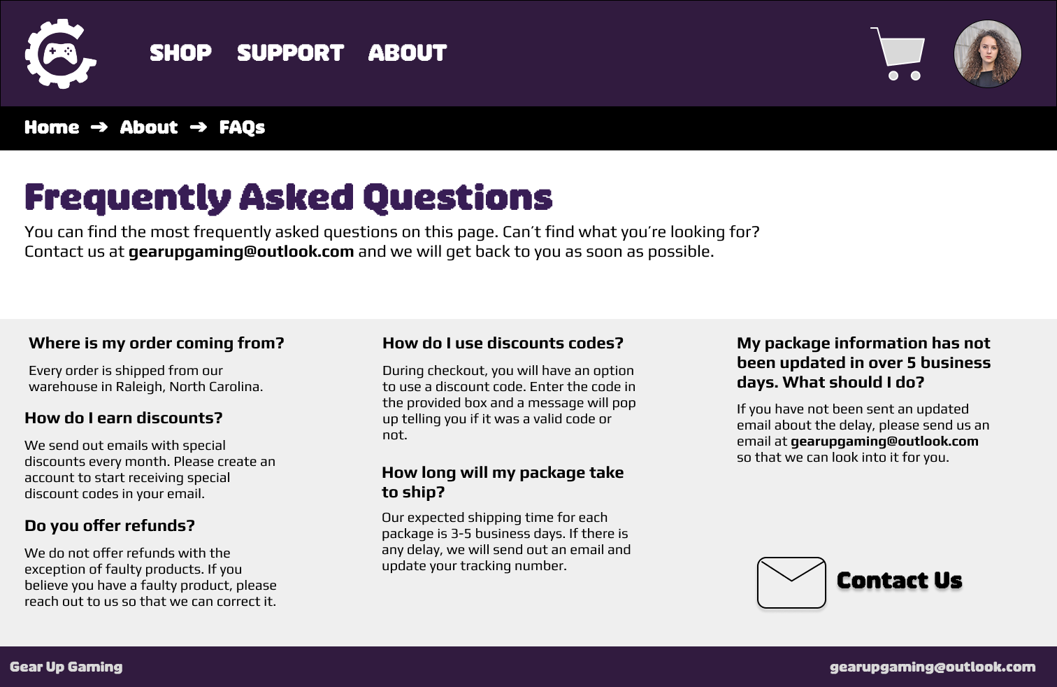
FAQ Page
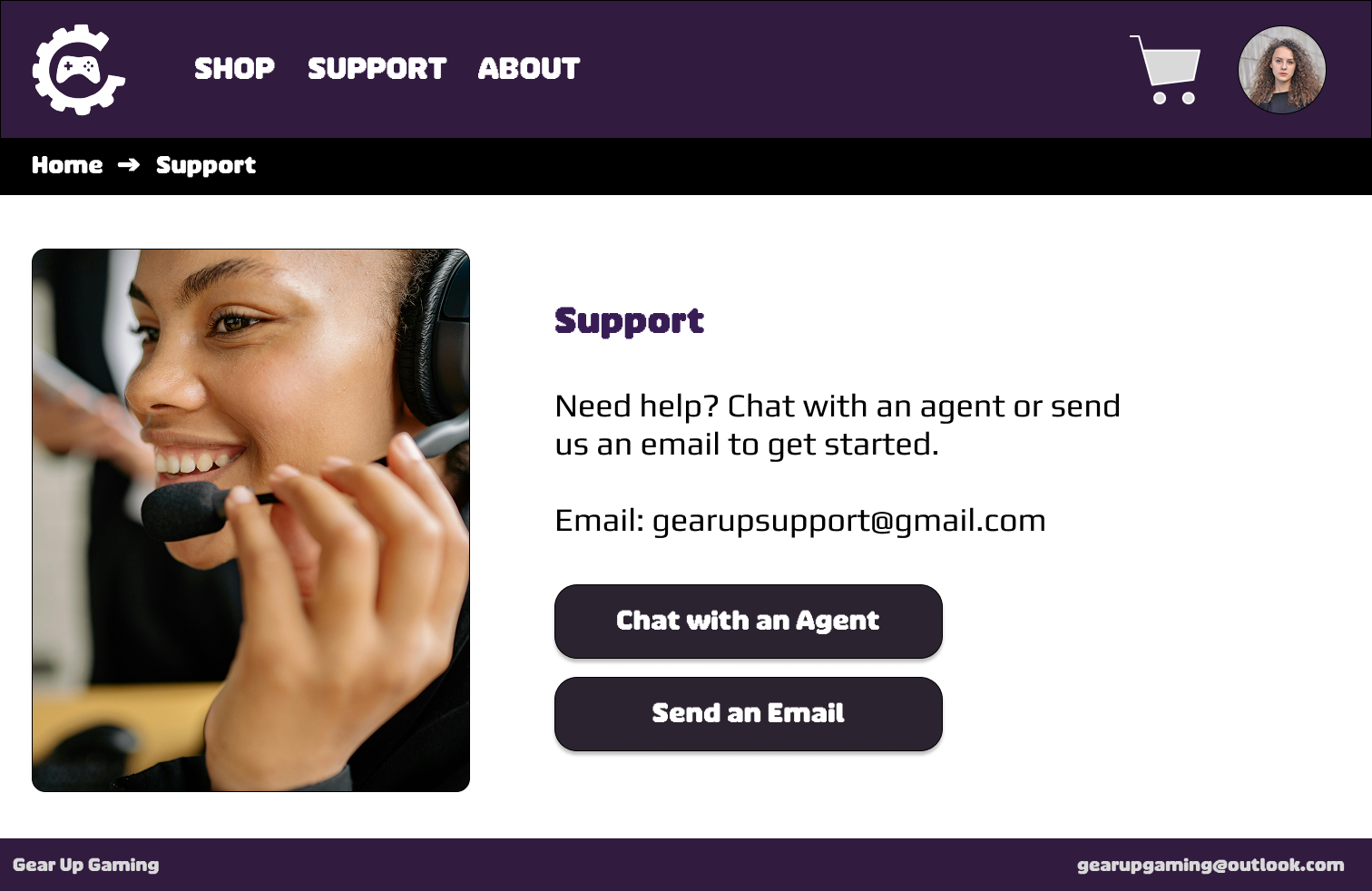
Support Page
Reflection
This project reinforced the importance of designing for real-life constraints, where users are not only focused on products but are also balancing priorities and making trade-offs throughout their decision-making process. It highlighted how important it is to understand user context, especially when financial limitations and time constraints play a role in shaping behavior.
One of the main challenges was balancing affordability with trust. While lower prices can attract users, they can also raise concerns about product quality and reliability. Because of this, the design needed to consistently communicate value and credibility at every stage of the experience. This included reinforcing trust through clear product information, structured layouts, and signals such as reviews and curated selections to help users feel more confident in their decisions.