
Treasure Trove Reviews
My Role
Designer & Researcher
Timeline
May - August 2025
Tools Used
Figma & Adobe XD
Responsibilities
Information Architecture, Wireframing, Prototyping, Research, Testing, & Documentation
Project Overview
About Treasure Trove Reviews
Treasure Trove Reviews is a game review platform that provides general game reviews, parental-focused reviews, and updates on game industry news. The website is designed to help users stay informed with timely and relevant content, including both in-depth reviews and current articles about developments in the gaming industry.
The Problem
Parents are often looking for trustworthy and straightforward reviews that help them understand the content their children are interacting with in games. At the same time, gamers want access to honest, detailed reviews and up-to-date industry news that help them make informed decisions about what to play and purchase. In many cases, existing platforms do not clearly separate or tailor content for these different audiences, which can make it harder for users to quickly find the information that is most relevant to them.
The Solution
To address these needs, Treasure Trove Reviews was designed as both a website and a mobile application, allowing users to access game reviews and news content anytime and anywhere. This improves accessibility and ensures that users can stay updated on the gaming industry even when they are on the go.
The platform also includes features that allow users to save reviews and news articles so they can revisit them later at their convenience. In addition, a recommendation system was designed to surface relevant content based on user activity, helping users discover new articles and reviews that match their interests.
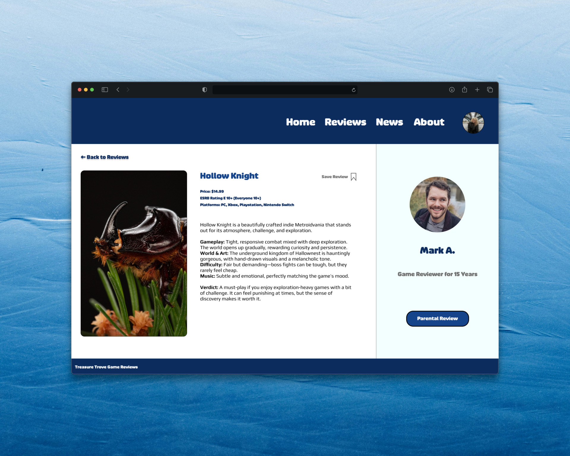
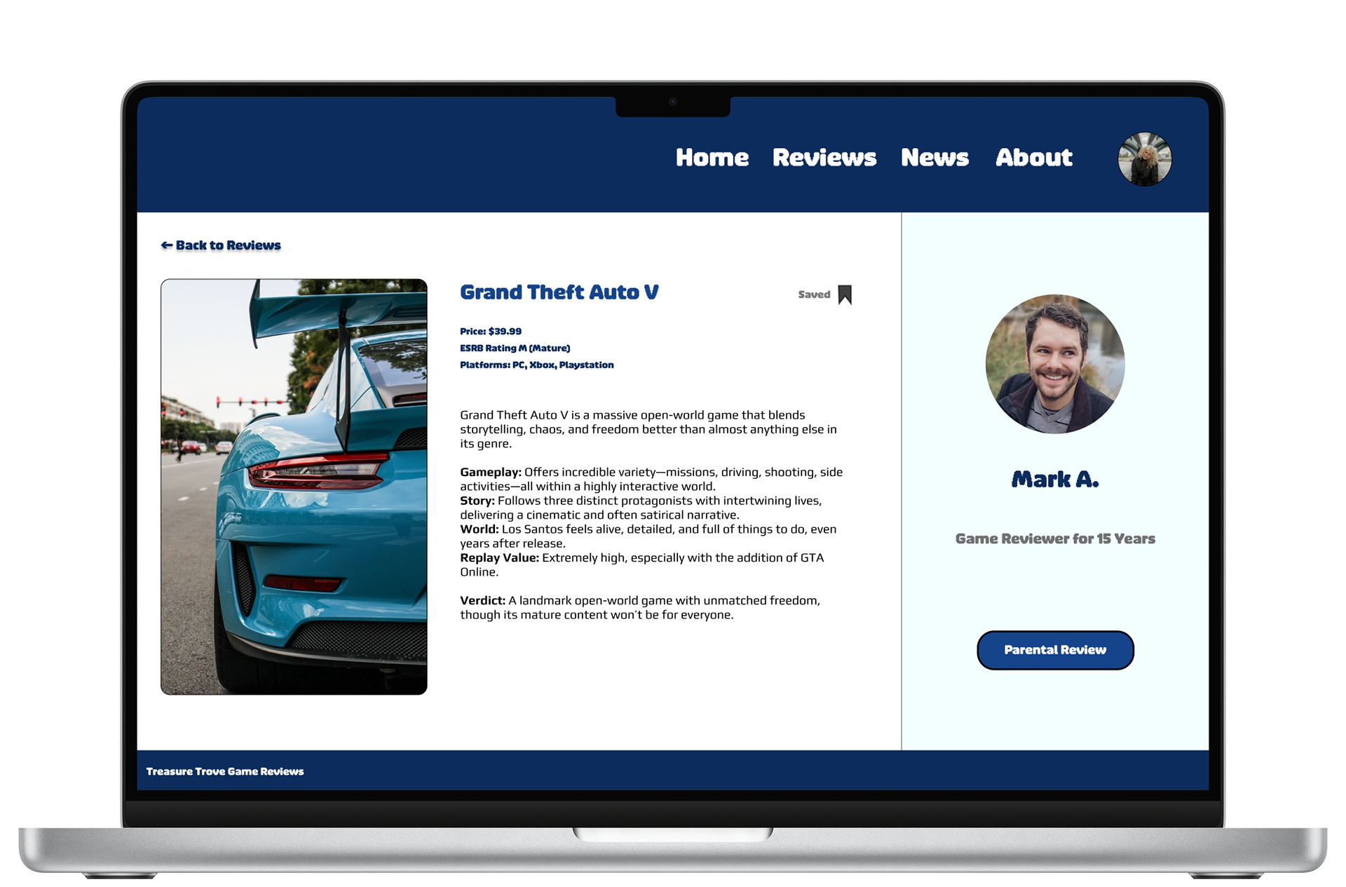
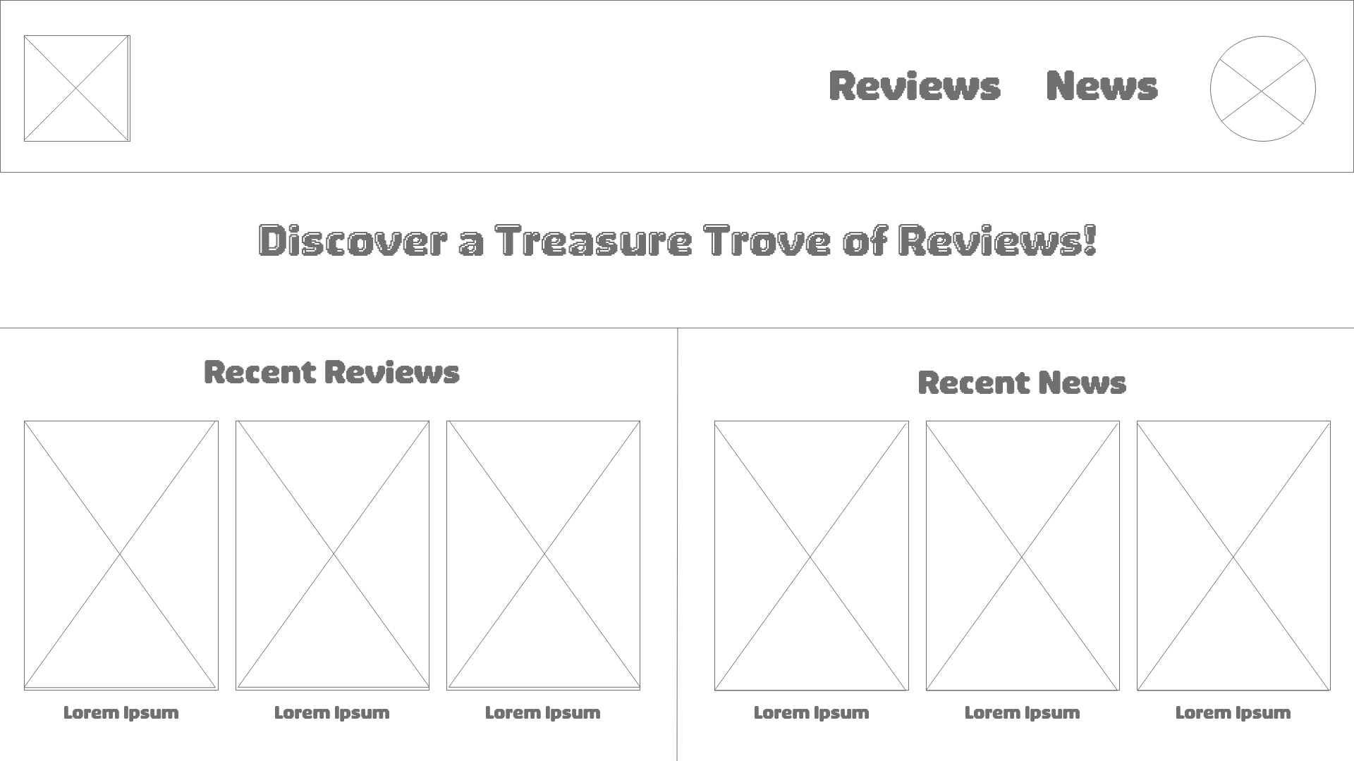
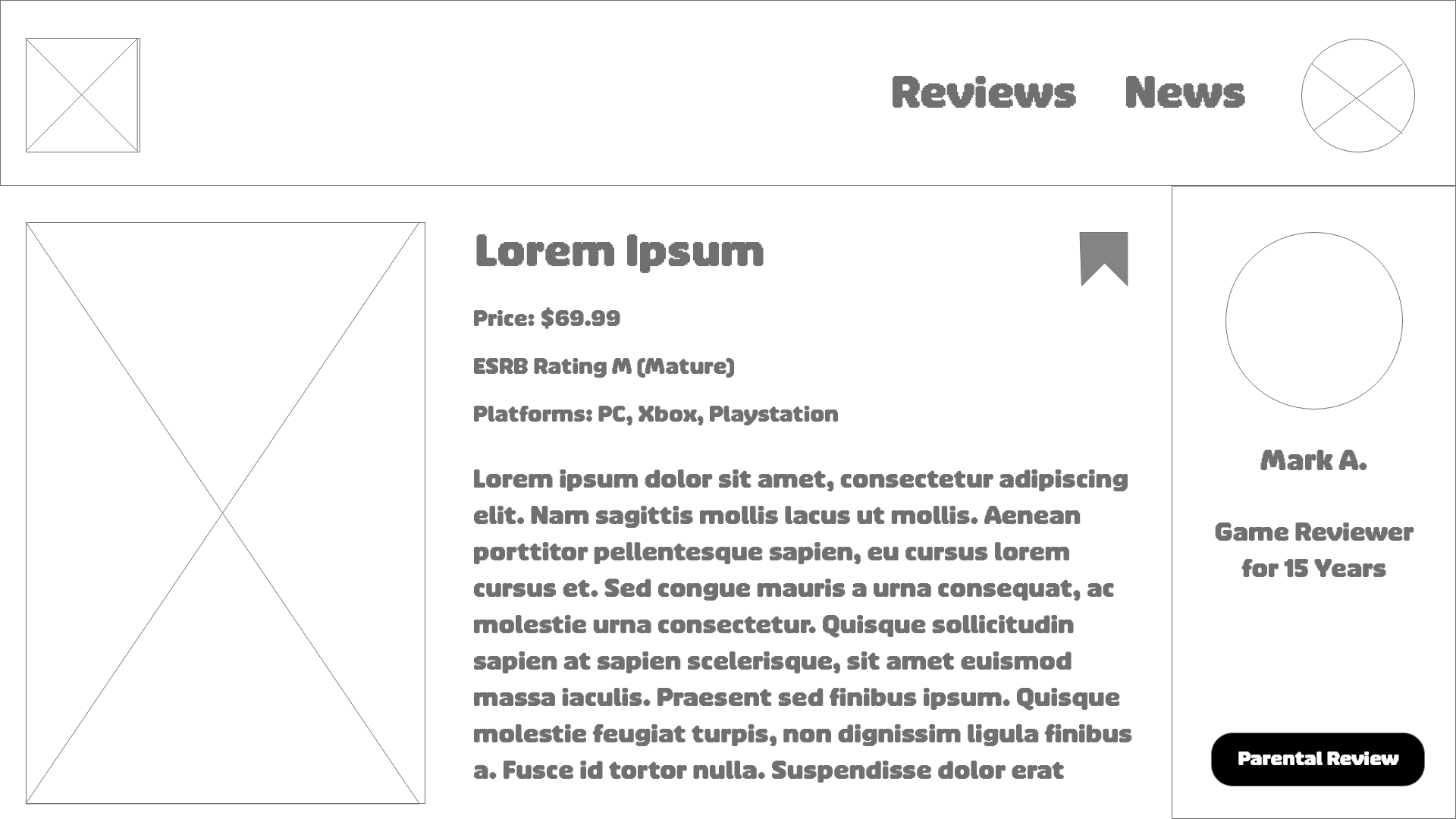
Game Review Screen
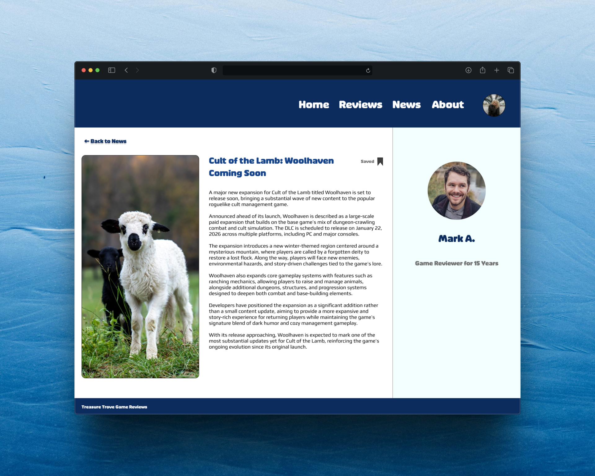
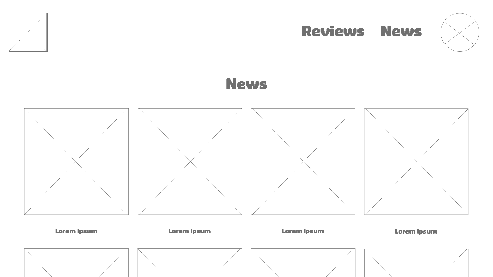
News Article Screen
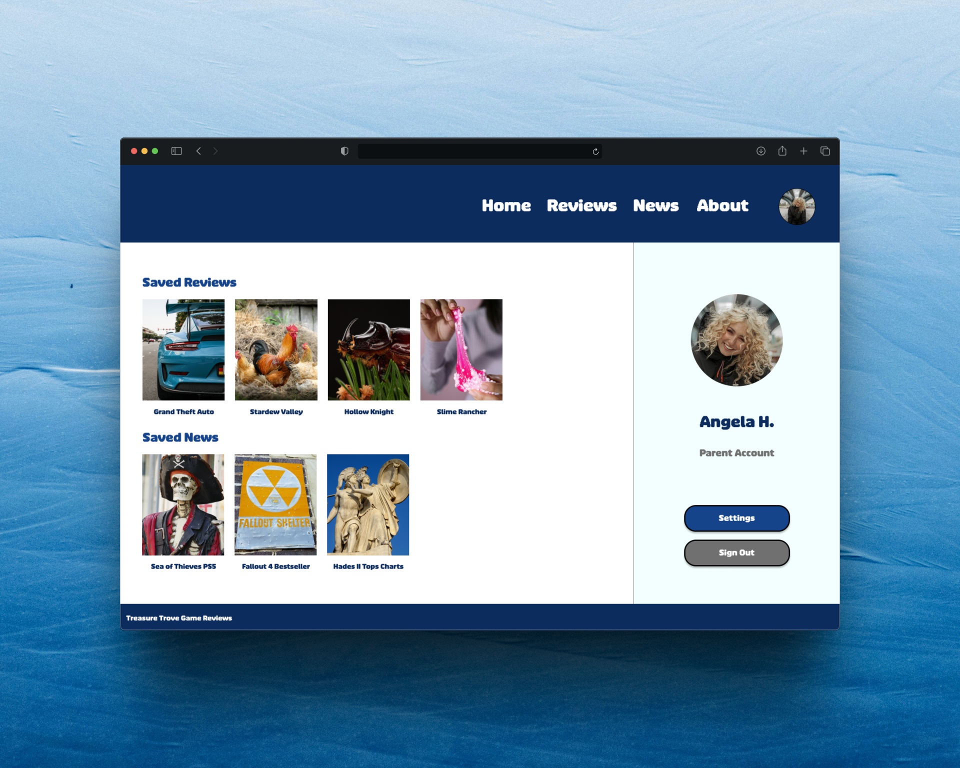
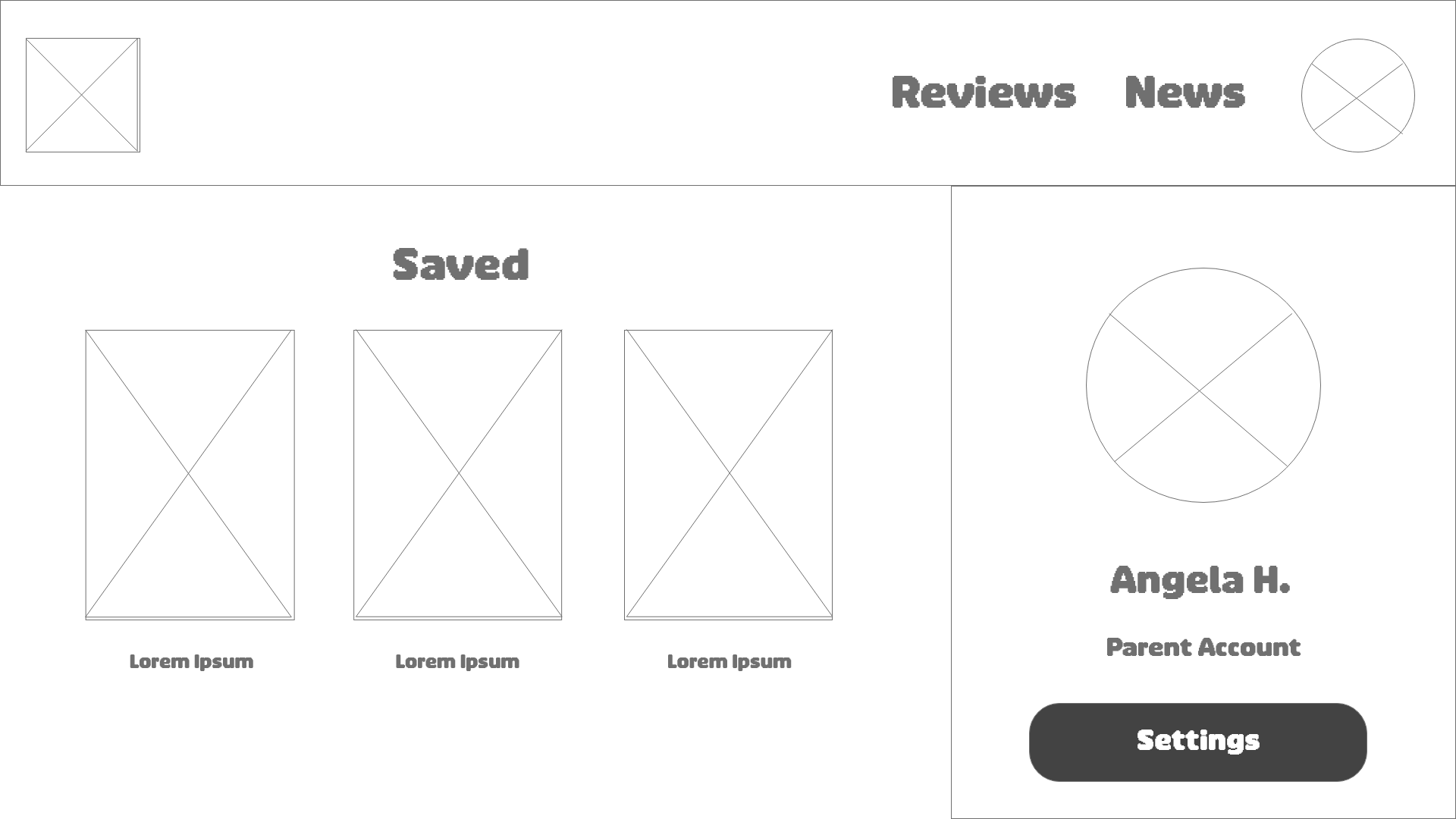
Profile Screen with Saved Reviews and News
Research
Methods Used
For this project, I used a combination of UX research and planning methods to better understand user needs and define the direction of the design. These methods included creating user personas, empathy maps, user journey maps, problem statements, and conducting a competitive audit. Through this process, I was able to explore different user perspectives and identify gaps in existing game review platforms. I focused on researching two primary user groups and analyzing what current websites were lacking in terms of content, usability, and trustworthiness.
Personas
I developed two main user personas to represent the core audiences for this project. The first group consisted of parents of children under the age of 16. This group is primarily interested in clear, honest, and reliable reviews that help them evaluate whether games are appropriate for their children. They need trustworthy information that allows them to make informed decisions about what their children are playing and whether the content aligns with their values and expectations.
The second group consisted of college students. This audience is more focused on staying informed about recent game releases and making smart purchasing decisions. Since many college students have limited disposable income, they rely on detailed and honest reviews to determine whether a game is worth their time and money before making a purchase.
Digital Wireframes and Low-Fidelity Prototypes
During the wireframing and low-fidelity design phases, my project was still in its early stages and only included a limited number of frames. At the start, I built the initial structure in Adobe XD, which helped me quickly explore layout ideas and establish the basic flow of the application. As the project evolved and I needed more flexibility, I transitioned the design into Figma. This shift allowed me to take advantage of additional features, improved component management, and more efficient prototyping tools, which ultimately helped me refine and expand the overall design with greater confidence.
In the beginning, my prototype only included a few key screens: a home page, a user profile page, a review page, a news page, and a single example game review layout. These early frames served as the foundation for the project and helped define the core structure of Treasure Trove Game Reviews. From there, I was able to identify gaps in the user experience and begin expanding the design to better support navigation, content discovery, and user interaction. This iterative process allowed the project to gradually develop into a more complete and cohesive prototype.
Original Home Page Concept
Original Game Review Page Concept
Original Profile Page Concept
Original News Page Concept
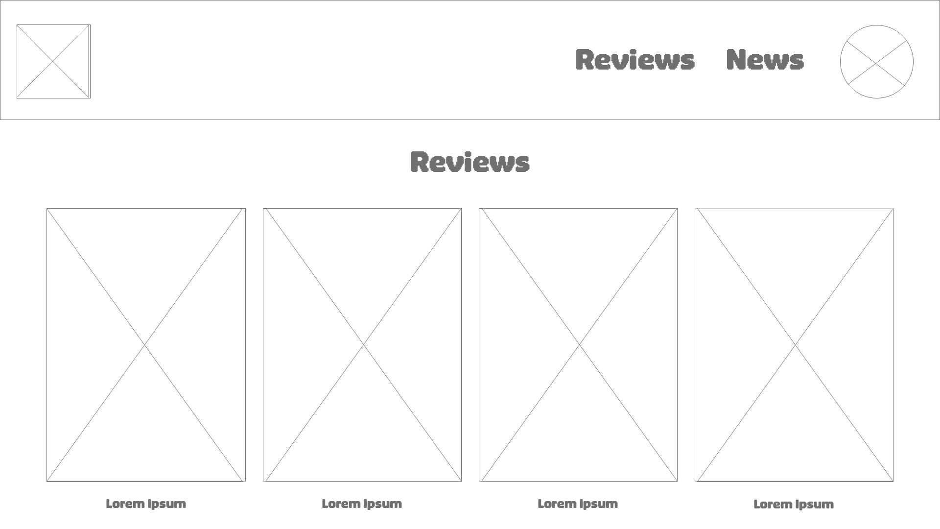
Original Reviews Page Concept
Usability Study
During the usability study, I moderated two separate sessions where participants were asked to follow a structured script and explore the website using the low-fidelity prototypes. The goal of these sessions was to observe how users naturally interacted with the interface, identify areas of confusion, and gather feedback on the overall usability and structure of the design.
Throughout the study, I took notes on user behavior, navigation patterns, and any points where participants hesitated or needed clarification. This helped me better understand how intuitive the layout was from a first-time user perspective. The low-fidelity prototype format also encouraged participants to focus on structure and functionality rather than visual design details.
The main insights from the study highlighted several key improvements. Users suggested that the home button needed to be more visible and easier to access, as it was not immediately clear how to return to the main page. Participants also pointed out that the pages should feel more connected to each other to improve overall navigation and flow throughout the site. In addition, users expressed interest in having an about page that explains the purpose of the website and how to use it. Another important piece of feedback was the request to separate saved content into distinct categories, such as saved news and saved reviews, instead of combining everything into a single general “Saved” section.
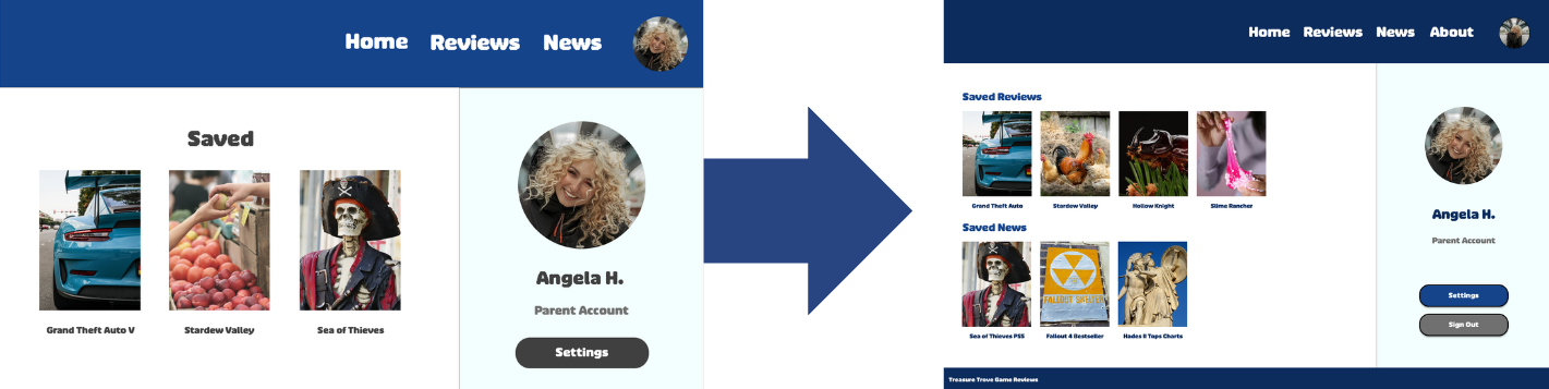
Profile Page and Saved Category Changes
High-Fidelity Prototype
Using the insights gained from the usability study, I was able to address and resolve the key pain points identified by participants. I began by applying the visual design elements, including the full image set and the chosen color scheme, to create a more cohesive and polished interface. This helped transition the project from a structural prototype into a more complete and visually consistent experience.
From a usability standpoint, I made several important improvements to the navigation system. I added a clearly visible home button to ensure users could easily return to the main page at any point. I also connected all of the frames more effectively to improve overall flow and reduce any confusion when moving between sections of the site. Each game review and article was given its own dedicated page, allowing for a more organized and detailed content structure.
In response to user feedback, I also separated the news and reviews sections within the profile page, replacing the previous single “Saved” area with more specific categories. Additionally, I created a dedicated about page to provide users with information about the purpose of the website and how to navigate it. To further improve consistency across the platform, I added a footer to every frame and designed interactive sign up and sign in pages to make the onboarding experience more engaging and functional.
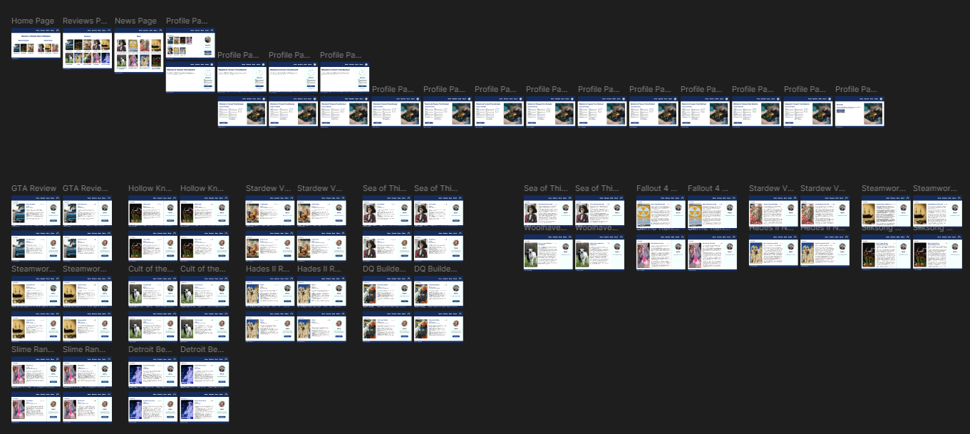
High-Fidelity Prototype Screenshot